gnuplot
Introduction
In this post, we will lay out the main motivations to use gnuplot and cover the essential concepts to get started with this program. Follows a collection of plots created using gnuplot along with the scripts and input data files used to produce them. These are provided in the hopes that will be useful and serve as a reference when you start creating your own plots.
All the features of this program cannot be covered in such a short chapter. Also, the topics presented here will be limited to 2D plots. The use of gnuplot in interactive mode is not covered, instead only the use of scripts reading data file as input is discussed.
The objective of this chapter is to provide you with enough knowledge to get started with gnuplot. As with any new tool, getting used to new concepts is difficult and you will need some practice before you quickly obtain the results you were expecting. But I encourage you to persevere as the use of gnuplot will significantly enhance the impression your articles make on the readers.
What is gnuplot?
gnuplot is a program that can generate 2D and 3D plots of functions, or data. Despite its name, this program is not part of the GNU project, although some of the GNU projects (such as Octave) rely on gnuplot to produce graphs.
Why use it?
There are two characteristics that make gnuplot very interesting.
The first characteristics is the fact it is scripted. This means that if you are processing large amount of data and need to generate a large number of plots, you can automate the graph generation quite easily.
The second desirable characteristic of gnuplot is its consistency. When generating figures for publications, relying on gnuplot will ensure that all your graphs are consistent with one-another in terms of line width, font size, etc. If you have ever created figures by exporting the graphs created by Excel to PNG, you will know that they always have slightly different sizes, causing them to appear with disparate font sizes once integrated into your article, the end-result appearing somewhat clumsy. There can also be cases where the resolution of the images created are not sufficient for the size of the figure in your article. Since gnuplot is capable of generating scalable graphics, you can be certain that it will be displayed clearly when you include the figure produced by gnuplot in a LaTeX document, regardless of how large the figure needs to appear.
Fundamentals
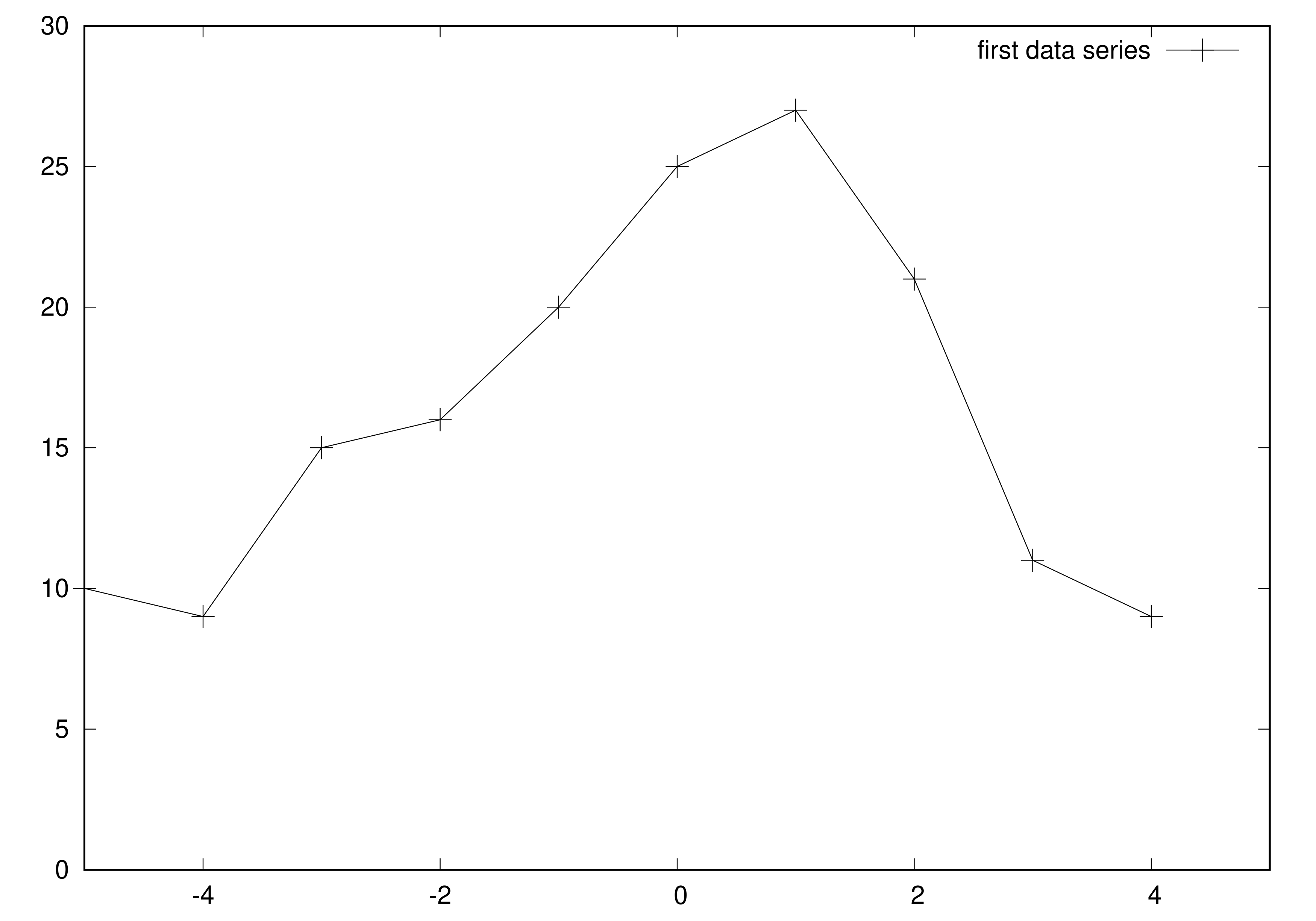
In this section, the essential gnuplot concepts are explained with the script and data files below as the supporting example.
example.plt
set terminal postscript eps enhanced
set output "example.eps"

set xrange[-5:5]
set x2range[-50:50]
set yrange[0:30]
set y2range[0:100]

set xlabel "xlabel"
set x2label "x2label"
set ylabel "ylabel"
set y2label "y2label"
set title "title"

plot 'example.csv' with linespoints title "first data series"
example.csv
-5  10
-4  9
-3  15
-2  16
-1  20
0   25
1   27
2   21
3   11
4   9
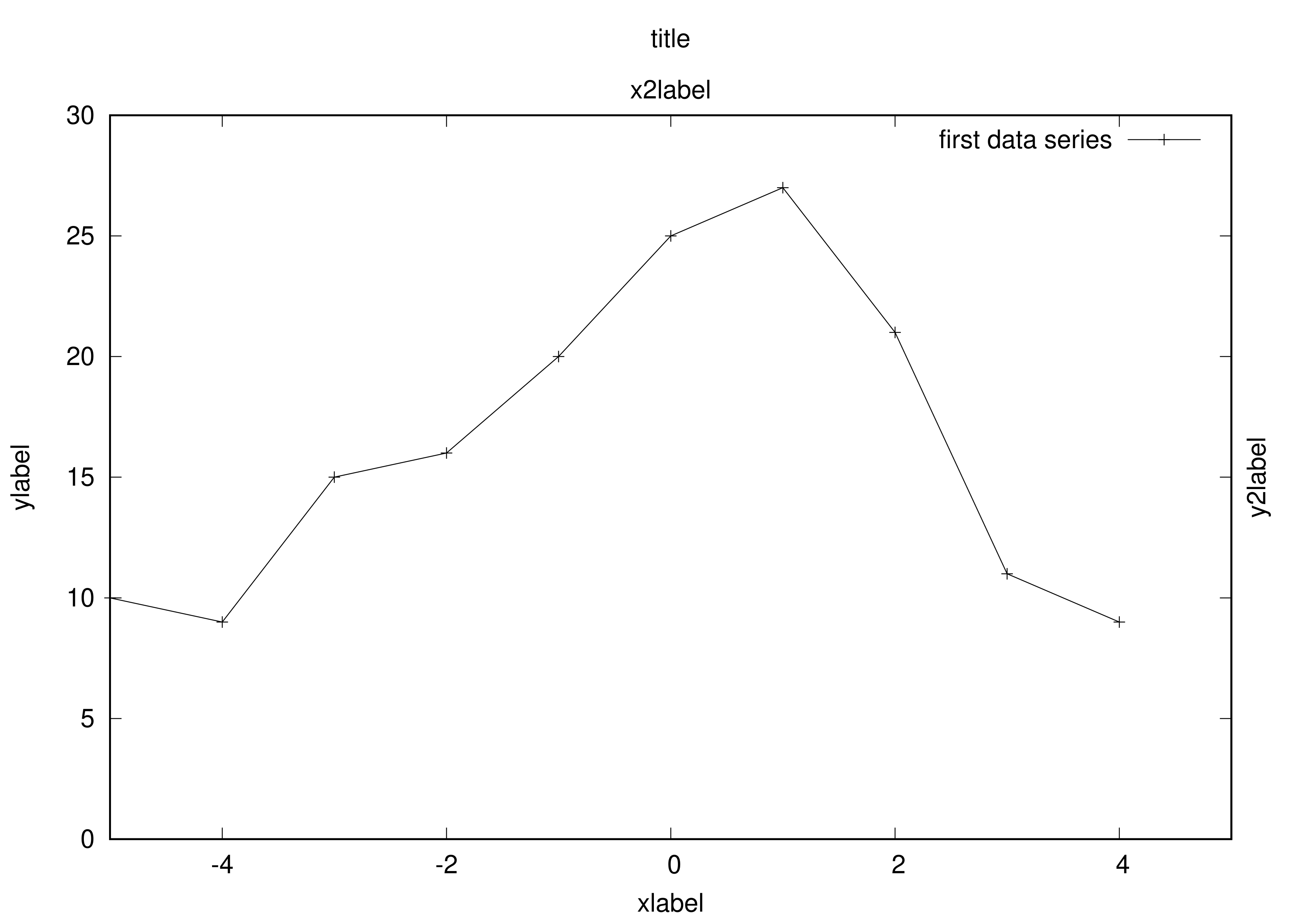
Assuming that both files example.csv and example.plt) are present in the current directory, simply run the following command to generate the image above:
gnuplot -c example.plt
This will generate file example.eps in the same directory.
Terminal
In gnuplot, a terminal determines the output format of a script. In the script example.plt, the terminal used is eps with options enhanced as specified on line 1. The file to which the figure file is saved is indicated on line 2: example.eps.
The table below shows some of the terminal available and their respective output format.
Caption Terminals available in gnuplot
| Terminal | File output format |
|---|---|
| pngcairo | Portable Network Graphics (PNG) |
| eps | Postscript (vector graphics) |
| Portable Document Format (PDF) |
Axes
For a 2D graph, there are 4 axes available:
-
x, the bottom horizontal axis -
y, the left hand side vertical axis -
x2, the top horizontal axis -
y2, the right hand side vertical axis
As you will see, there are a number of analogous commands that deal with each of these axes. For instance:
-
set xrange[-5:5]sets the range of the x axis -
set xlabel "descritpion of x axis"sets the x axis label
Tics
The tics are the small and the labels that annotate each axis. By default, the coordinates of the x and y axis are used. You can also choose to hide the Tics by entering command unset xtics or unsed ytics.
Data series
A data series is drawn on the graph by gnuplot using the plot command. When called to be drawn with the plot command, it is possible to give a title to the data series, causing it to appear in the Key.
Generally, the data to be plotted is kept in one or multiple .dat or .csv files. If you are using Comma-Separated Values (CSV), you may need to indicate to gnuplot which character is used to separate the columns. For instance, is you are using semicolons, you will have to use the following command to instruct gnuplot to distinguish columns using semicolons:
set datafile separator ";"
Also note that if you are including text strings in your data file (either for xtics label or for the name of the data series), you should use quotes to make sure spaces within a text string are not confused for a change of column by the program.
Key
The key is the part of the plot in which the meaning of each line or bar drawn on the graph. It can be placed either:
- inside the plot (default behavior)
- outside the plot, for instance below with command
set key below - removed entirely with command
unset key
The case against using colors
When creating figures with gnuplot, you are able to choose exactly how data series are plotted, and with which style (shape of the marks, pattern for filled regions, patterns used for the lines). My personal view on the matter is the following: in articles and otherwise written publications, the use of colors is best avoided. This is for 3 main reasons:
- By using colors you make it difficult for color-blind scientist to read your articles.
- There is a non-insignificant chance that people will print your article in grayscale anyway. If you want your figures and plots to remain legible even when printed in grayscale, it is best to design them in grayscale in the first place.
- There are cases where journals will impose an additional fee for each page which features color.
For more elaborated arguments and recommendations about the use of colors in figures, I highly really recommend you read the Color Blind Accessibility Manifesto. Basically, if you do use colors, you need to make sure that even printed in black and white that it is still possible to read it correctly. In practice, there is sufficient variety in the grayscale plotting styles supported by gnuplot that I never felt I needed colors.
Using gnuplot in practice
Adjusting the font size
When including a graphics as a figure in a document, it is important that the text of said figure remains legible. If you are making a submission to a conference requiring the use of a two column format for your article, you will need to increase the size of the font for the column figures. If you don’t, you risk your figures looking like the figure below where the text is too small to be legible.
To remedy this problem, you can modify your gnuplot script to specify the font size as an option when setting the terminal. For instance, replacing line 1 of example.plt with command
set terminal postscript eps enhanced font ",30"
will make the font size larger, making it suitable for display in smaller size as shown below:
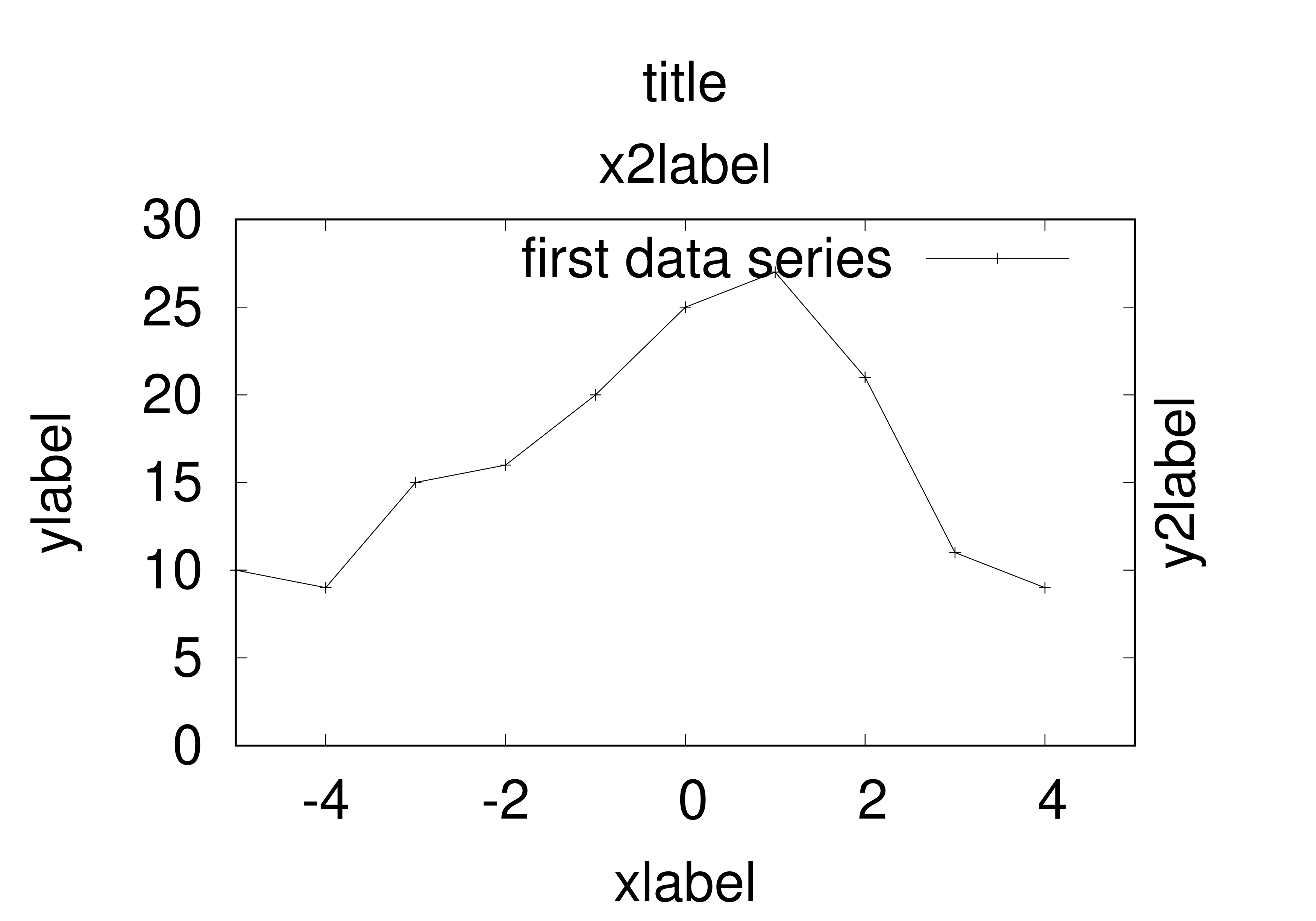
In my experience, the default size used by gnuplot is suitable for full page-width figures in letter or A4 format. For figures that need to fit inside a column of a 2-columns article, setting \lstinline|font “,18”| generally gives appropriate results. The important thing to keep in mind is that you should adjust the font size so that everything remains legible. Also try to remain consistent across figures.
Specifying how to use columns of the data file
Each plot style has a default expectation for the input data format. For instance, the linespoints plot style will use the two first columns of input data as the “x” and “y” coordinates of each point.
This can be overwritten by specifying the columns to use in the plot command. If you need to explicitly specify the columns to use in your data file to plot a data series, you can do so by with the using <column specification> option in the plot command. For instance, to use the first and second column in the data file as the X and Y coordinates when plotting points, you would write
plot "data.csv" using 1:2
You can also use this using option to specify the text that should appear in the tics. In some cases such as histograms, it can be useful to display some text for each column rather than a number. Assuming the height of the columns is contained in the second column and the labels are in the first columns, you would use the following command:
plot "data.csv" using 2:xticlabels(1)
For more illustrative use cases, see gnupot Anthology section below.
Index in data file
Sometimes separating data series by inserting a new column in the data file is not possible, or does not make sense. If you are trying to plot two lines that have points at the same “x” coordinates and different “y” coordinates, you can gather that data in a single 3 column block as shown in the Lines example. Plotting these two data series can then be done using the following command:
plot "data.csv" using 1:2 with linespoints, "" using 1:3 with linespoints
However, if the “x” coordinates differ for your second data series, this is not an option. You could place each data series in a separate data file and specify the appropriate file in the \lstinline|plot| command of your script. Another solution is to use indices.
An index, in gnuplot terminology, is a way to separate data within a file into multiple groups. Basically, leaving 2 empty lines in you data file separates what is above and below these empty lines into two different “indices.” Then, in you gnuplot script, you can designate a specific index by specifying index X (where X designates an integer) just after the file specification. For a concrete example, refer to the Points example
Abbreviations
There are short versions for most of the keywords used by gnuplot. These are exactly synonymous and can significantly shorten the length of the plot command, at the cost of legibility for the less experienced user. The table below gathers the most commonly used abbreviations in alphabetical order.
Common abbreviations used in gnuplot scripts
| keyword | abbreviation |
|---|---|
| columnheader | col |
| fillstyle | fs |
| line style | ls |
| line width | lw |
| point type | pt |
| title | ti |
| using | u |
gnuplot Anthology
In this section, a number of figures created using gnuplot are shown. Some of them I created specifically for this occasion, some of them are taken from some of my publications. My personal hope is that they will be a source of inspiration when it becomes time for the reader to create their own graphs.
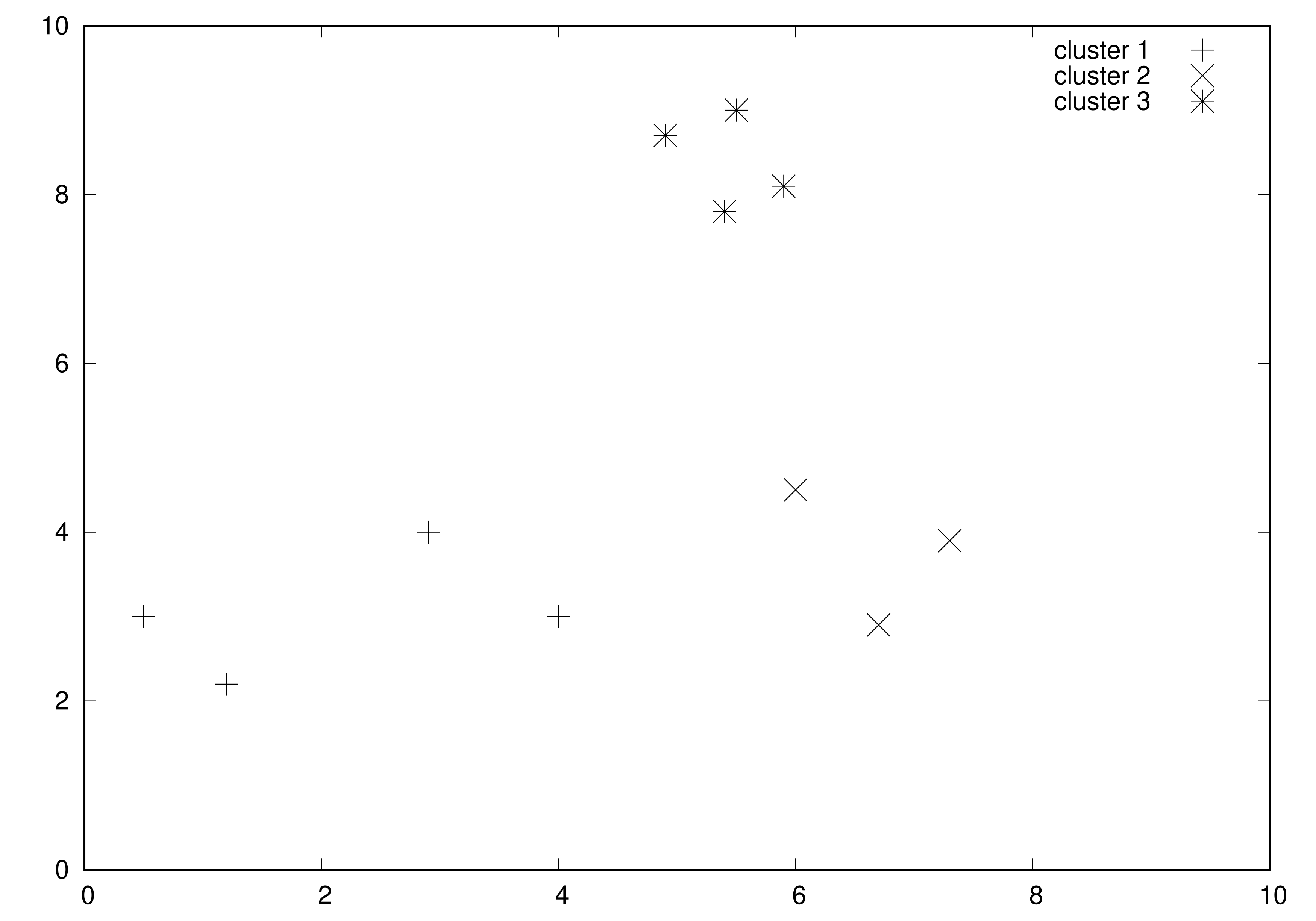
Points
xypoints.plt
set terminal postscript eps enhanced
set output "xypoints.eps"
set xrange [0:10]
set yrange [0:10]
plot "xypoints.csv" index 0 with points title "cluster 1" pointtype 1 pointsize 2, \
    "" index 1 with points title "cluster 2" pointtype 2 pointsize 2, \
    "" index 2 with points title "cluster 3" pointtype 3 pointsize 2
xypoints.csv
0.5	3.0
1.2	2.2
4.0	3.0
2.9	4.0


6.0	4.5
6.7	2.9
7.3	3.9


5.4	7.8
4.9	8.7
5.9	8.1
5.5	9.0
xypoints.eps
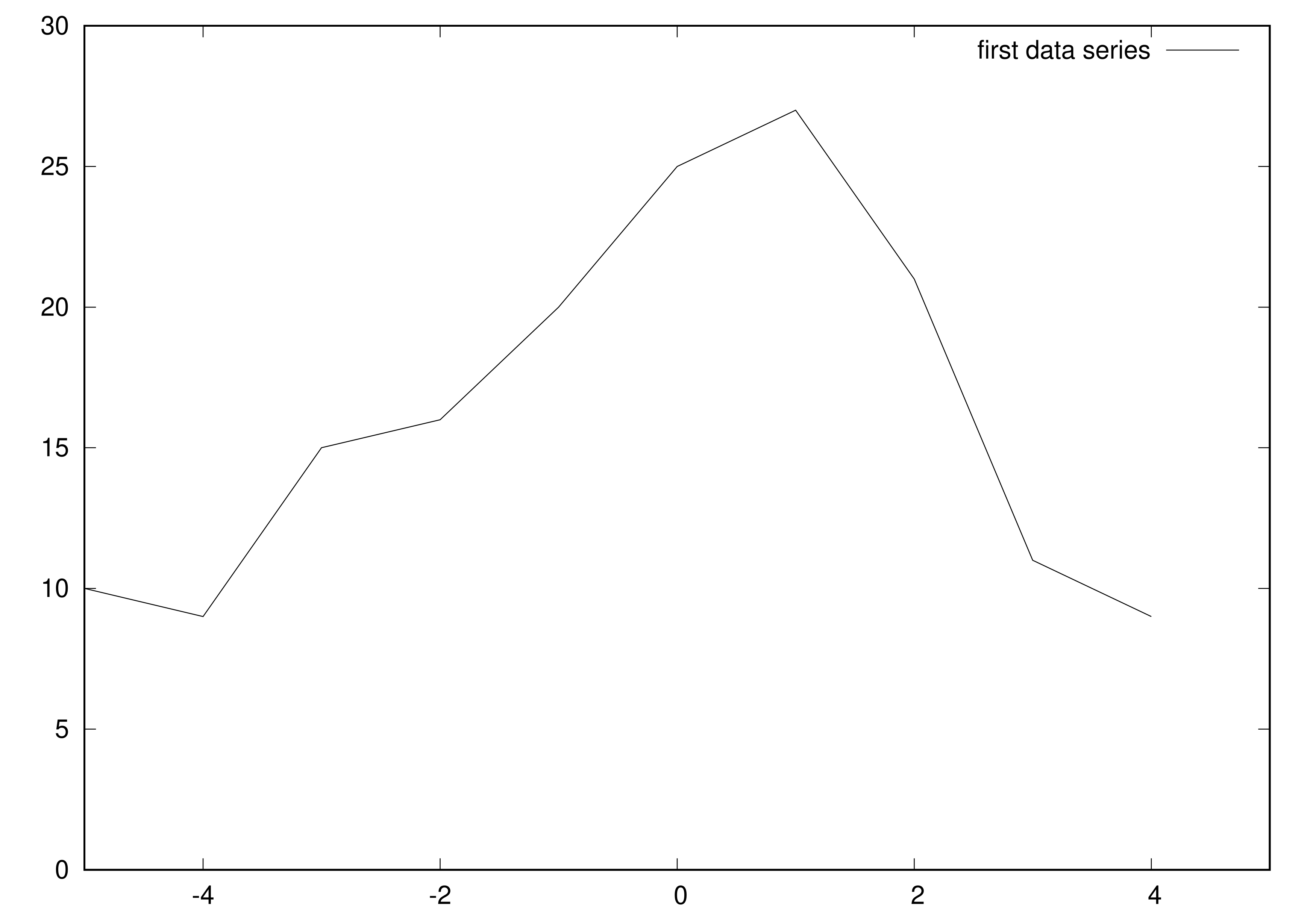
Lines
lines.plt
set terminal postscript eps enhanced
set output "lines.eps"

set xrange[-5:5]
set yrange[0:30]

plot 'linespoints.csv' with lines title "first data series"
lines.csv
-5  10
-4  9
-3  15
-2  16
-1  20
0   25
1   27
2   21
3   11
4   9
lines.eps
Linespoints
linespoints.plt
set terminal postscript eps enhanced
set output "linespoints.eps"

set xrange[-5:5]
set yrange[0:30]

plot 'linespoints.csv' with linespoints title "first data series" pointsize 2
linespoints.csv
-5  10
-4  9
-3  15
-2  16
-1  20
0   25
1   27
2   21
3   11
4   9
linespoints.eps
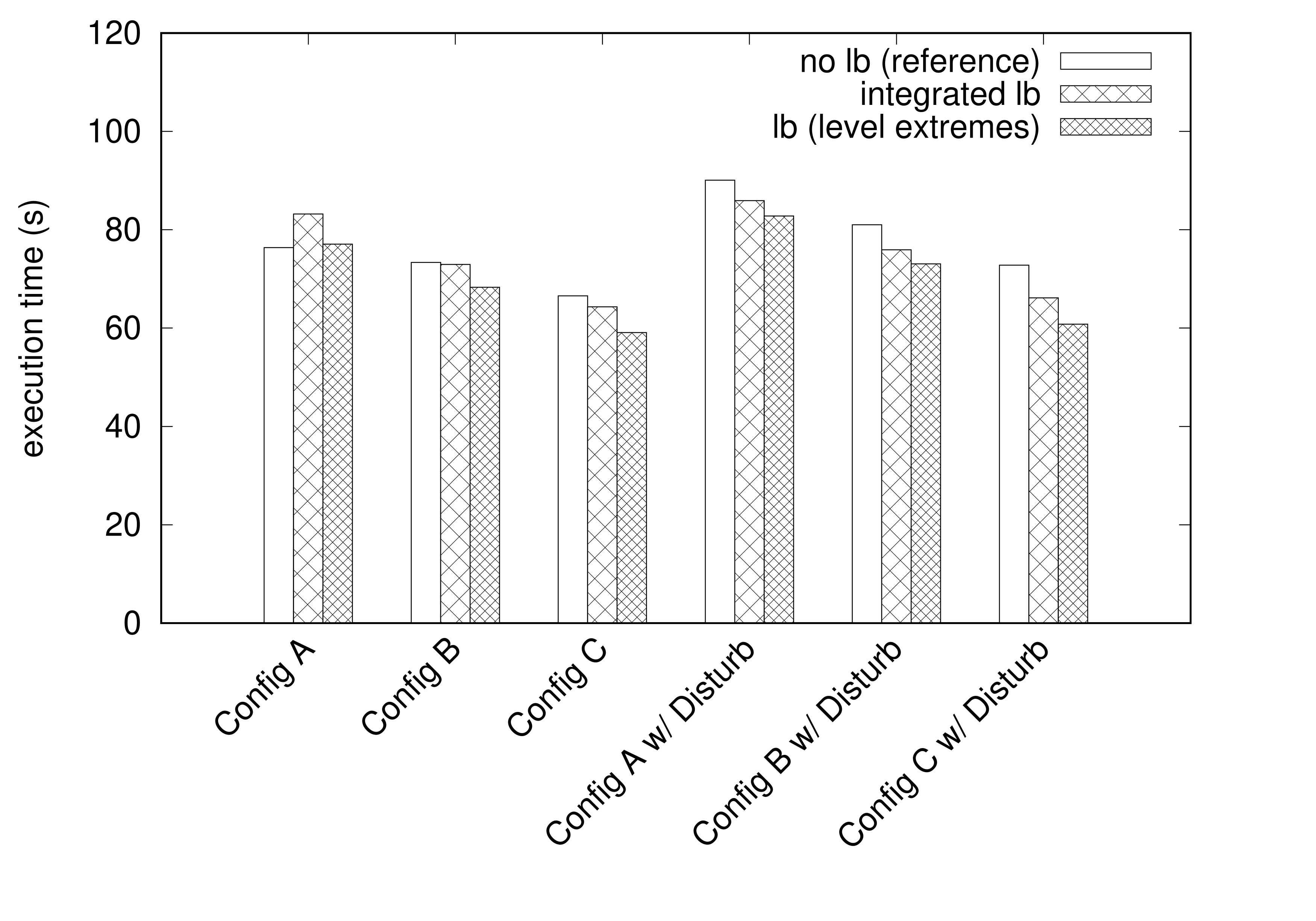
Histogram
histogram.plt
set terminal postscript eps enhanced font ',18'
set output "histogram.eps"
set style data histogram
set style histogram clustered gap 2
set style fill pattern border -1
set yrange [0:120]
set ylabel "execution time (s)"
set xtics rotate by 45 right

plot 'histogram.csv' using 2:xticlabels(1) ti col ls -1, \
    '' u 3 ti col ls -1, \
    '' u 4 ti col ls -1
histogram.csv
"Configuration"	"no lb (reference)"	"integrated lb"	"lb (level extremes)"
"Config A"	76.37838355	83.21568331	77.08452905
"Config B"	73.37327029	72.96047402	68.30707056
"Config C"	66.57504399	64.32993027	59.0886266
"Config A w/ Disturb"	90.09265992	85.91455964	82.78284324
"Config B w/ Disturb"	81.01966028	75.91681128	73.05372715
"Config C w/ Disturb"	72.81182879	66.14741039	60.79430682
histogram.eps
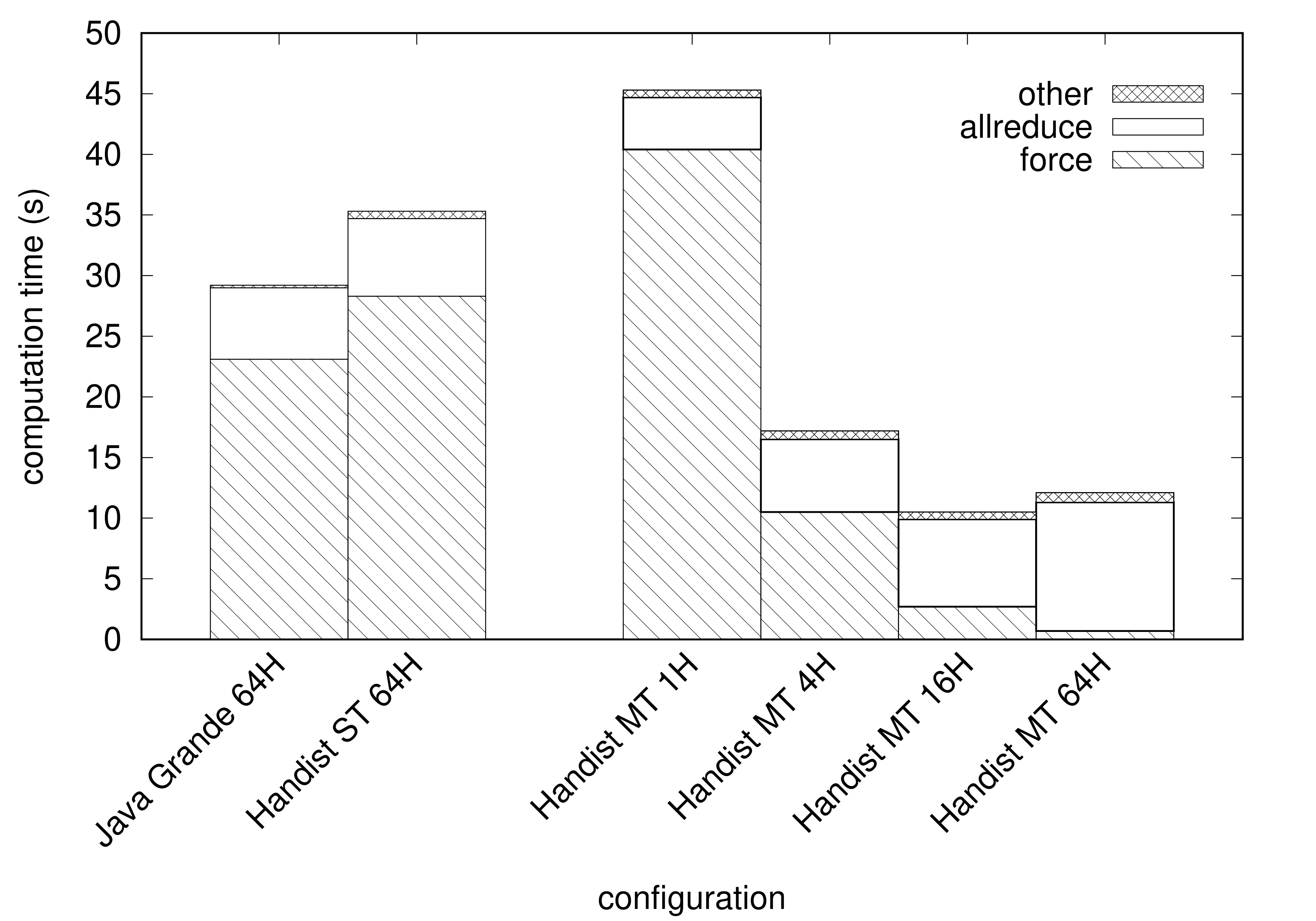
Stacked Histogram
stacked_histogram.plt
set terminal postscript eps enhanced font ",18"
set output "stacked_histogram.eps"
set palette gray
set style data histogram
set style histogram rowstacked
set xtics rotate by 45 right
set key invert
set ylabel "computation time (s)"
set xlabel "configuration"
plot newhistogram lt 1, \
    "stacked_histogram.csv" index 0 u 2:xtic(1) title "force" ls -1 fs pattern 4, \
    "" index 0 u 3 title "allreduce" ls -1 fs pattern 0, \
    "" index 0 u 4 title "other" ls -1 fs pattern 2, \
    newhistogram lt 1, \
    "stacked_histogram.csv" index 1 u 2:xtic(1) notitle ls -1 fs pattern 4, \
    "" index 1 u 3 notitle ls -1 fs pattern 0, \
    "" index 1 u 4 notitle ls -1 fs pattern 2
stacked_histogram.csv
# index 0
"Java Grande 64H"	23.1	5.9	0.2
"Handist ST 64H"	28.3	6.4	0.6


# index 1
"Handist MT 1H"    	40.4	4.3	0.6
"Handist MT 4H"    	10.5	6.0	0.7
"Handist MT 16H" 	 2.7	7.2	0.6
"Handist MT 64H"  	 0.7   10.6	0.8
stacked_histogram.eps
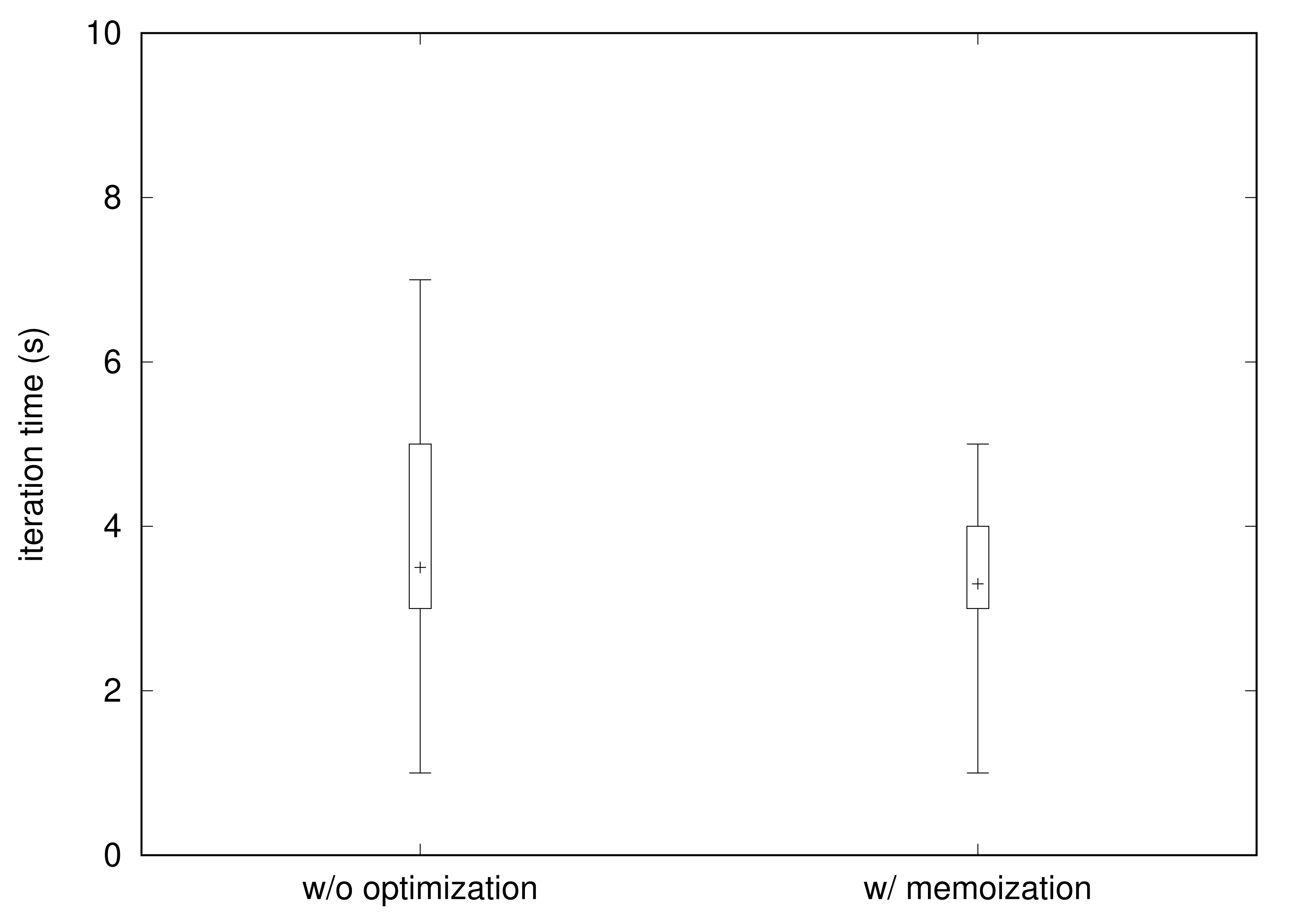
Error box and whiskers
error-boxes.plt
set terminal postscript eps enhanced font ',18'
set output "error-boxes.eps"

set errorbars 4.0

set yrange [0:10]
set xrange [-0.5:1.5]

set ylabel "iteration time (s)

plot "error-boxes.csv" using 2:4:3:7:6:xtic(1) notitle with candlesticks whiskerbars, \
    "" using 2:5 with points notitle
error-boxes.csv
# xtic               x   min 1Q  median  3Q  max
"w/o optimization"   0   1   3   3.5     5   7
"w/ memoization"     1   1   3   3.3     4   5
error-boxes.eps
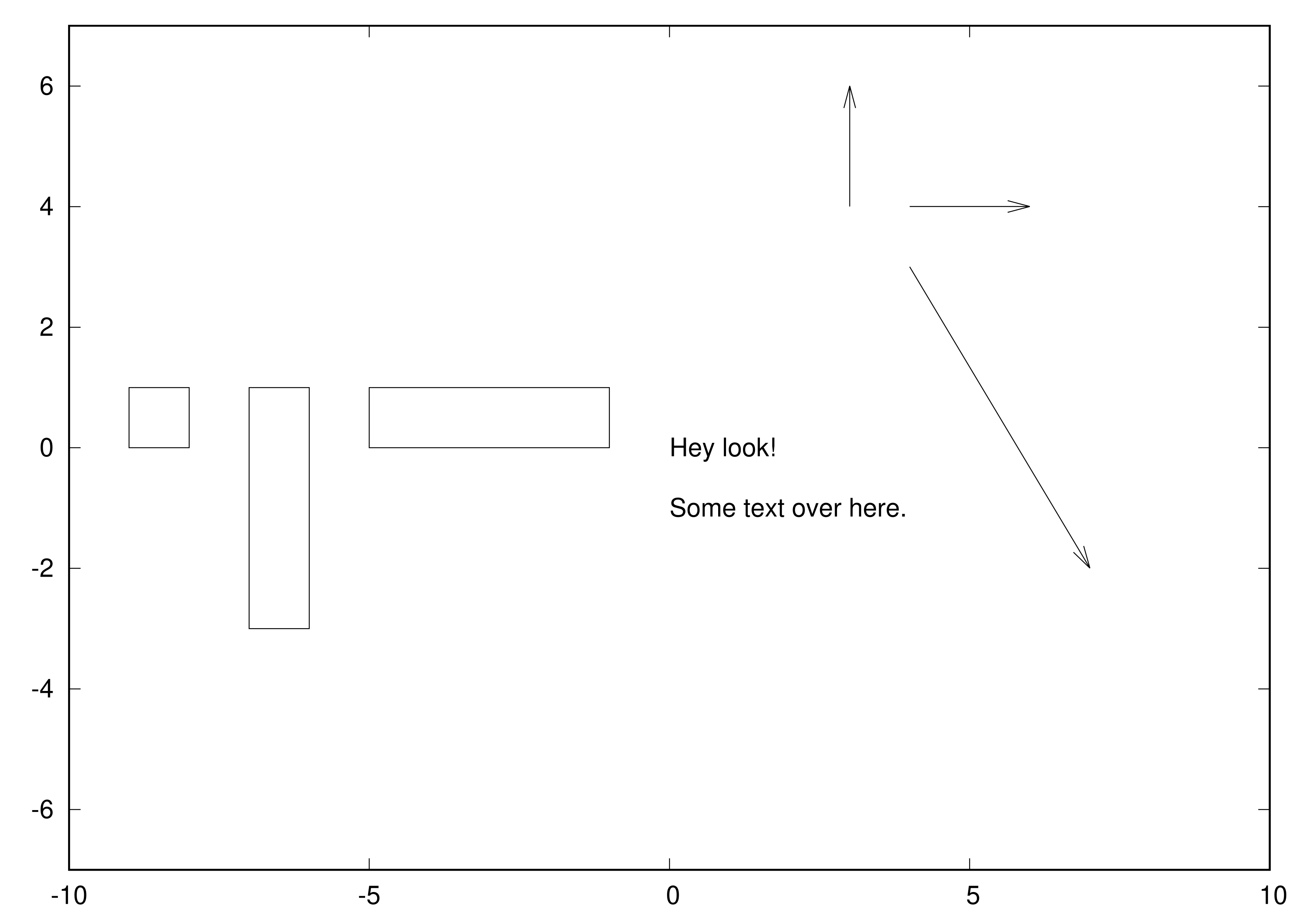
Rectangles, Arrows, and Labels
You can place rectangles, arrows, and labels at arbitrary places over plotted data. This is useful when you want to annotate or highlight a particular detail. No CSV file is needed to insert such elements in a figure.
rectangles.plt
set terminal postscript eps enhanced
set output "rectangles.eps"

set xrange[-10:10]
set yrange[-7:7]

set object 1 rectangle from -9,0 to -8,1
set object 2 rectangle from -7,1 to -6,-3
set object 3 rectangle from -5,0 to -1,1

set label "Hey look!" at 0,0
set label "Some text over here." at 0,-1

set arrow from 3,4 to 3,6
set arrow from 4,4 to 6,4
set arrow from 4,3 to 7,-2

plot NaN notitle # draws the plot without any data
rectangles.eps
To go further
As mentioned in the introduction, many features of gnuplot were not covered here, such as how to create 3D plots, how to use the interactive mode, the large variety of terminals available.
Moreover, the large number of plotting styles available and how to customize them exactly to one’s need was not discussed. Instead, I encourage the reader to experiment with the plots given in the anthology.
The ultimate reference about gnuplot features and commands remains of course the documentation available online. There you will be able to consult the effects of a particular command in great details. But unless you know exactly what you are looking for, it will probably be easier to look to Stack Overflow if you are encountering difficulties when making your figures.
Enjoy Reading This Article?
Here are some more articles you might like to read next: